Udemy is an online learning platform for any subject matter. The goal of this mobile app study is to improve the overall learning experience of the user by redesigning the current UI and UX of the app.
Overview
About Udemy
Udemy is a web and mobile app hub for teaching and learning any subject matter online. It is a platform that allows instructors from different parts of the world to build online courses on their subject of expertise. Udemy made learning accessible to users who want to learn and improve their skills through online education at the their own pace.
The purpose of this mobile app study is to improve the overall learning experience of the user by redesigning the current UI and UX of the app.
Apply a modern design in dark mode for the user’s comfortable viewing experience
Create divisions in each section
Improve the hierarchy
Improve the photography and typography
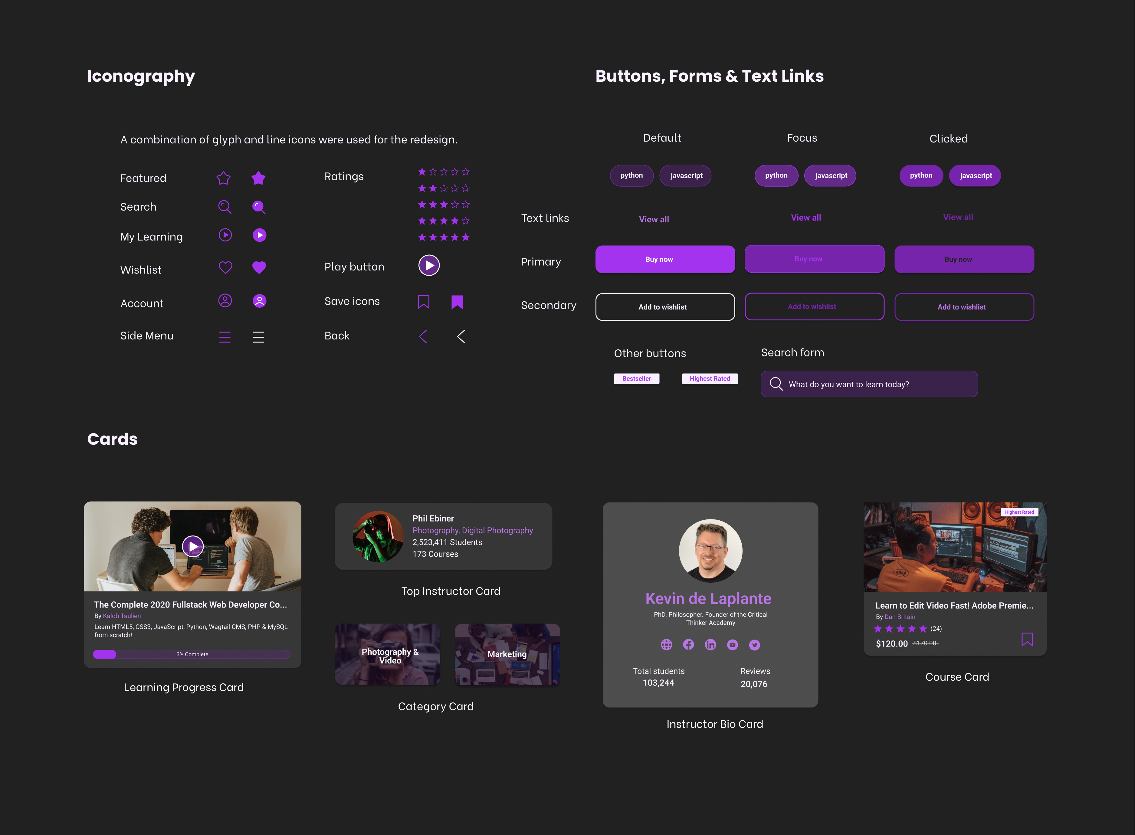
Create card templates that can be reusable for the entire app components to maintain design consistency
Proper alignment of elements
Reduce the implementation of different colours for the small buttons
Reduce clutter
User Interface Design
Typography
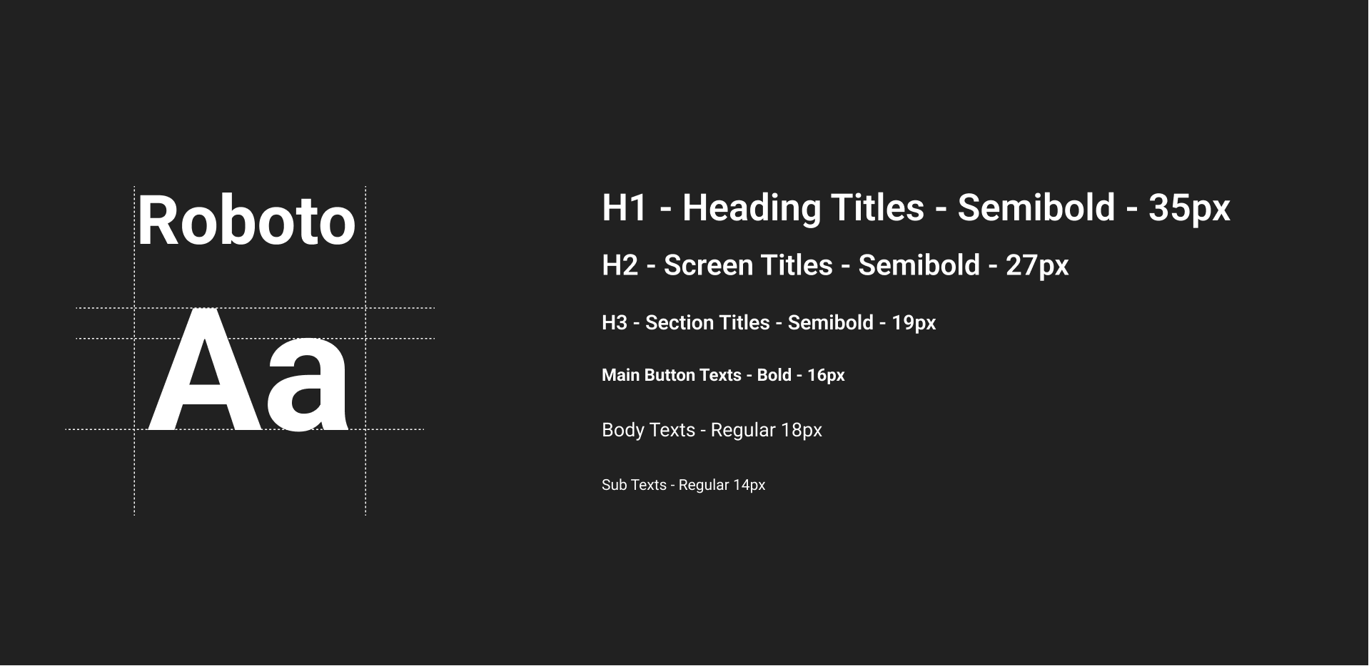
For the typography, I used the typeface “Roboto” which is a sans-serif typeface family. As Google Fonts described it on their website, “Roboto has a dual nature. It has a mechanical skeleton and the forms are largely geometric. At the same time, the font features friendly and open curves.” The typeface has good readability which is one of the most important consideration when it comes to choosing the typeface.
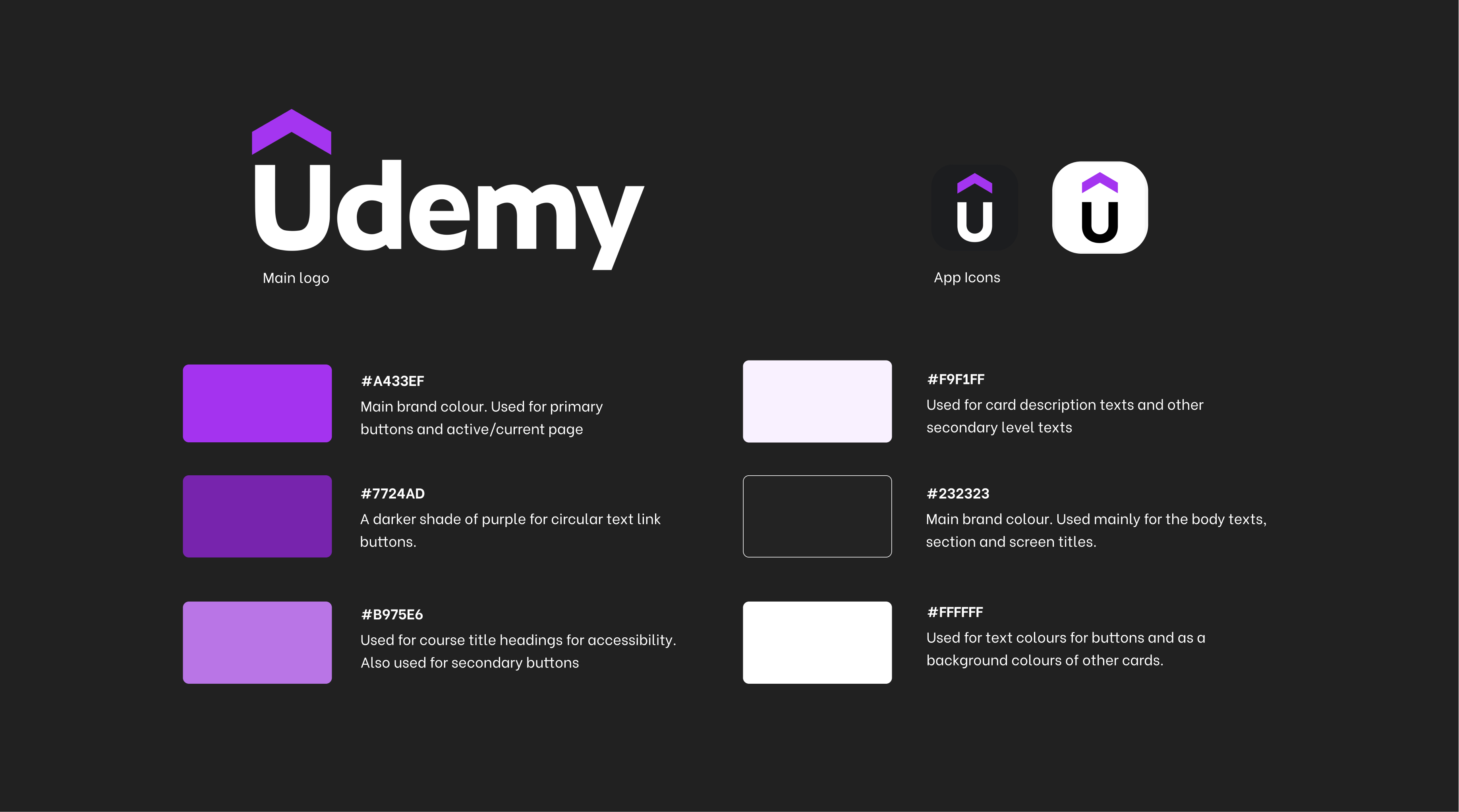
Brand Logo & Colours
As for the colours, I mainly used the current brand colours which are purple and black. The vivid and optimistic shade of purple signifies growth, learning, and possibilities which is the main purpose of the brand. The black represents boldness and eagerness.
UI Components
Redesigned Screens
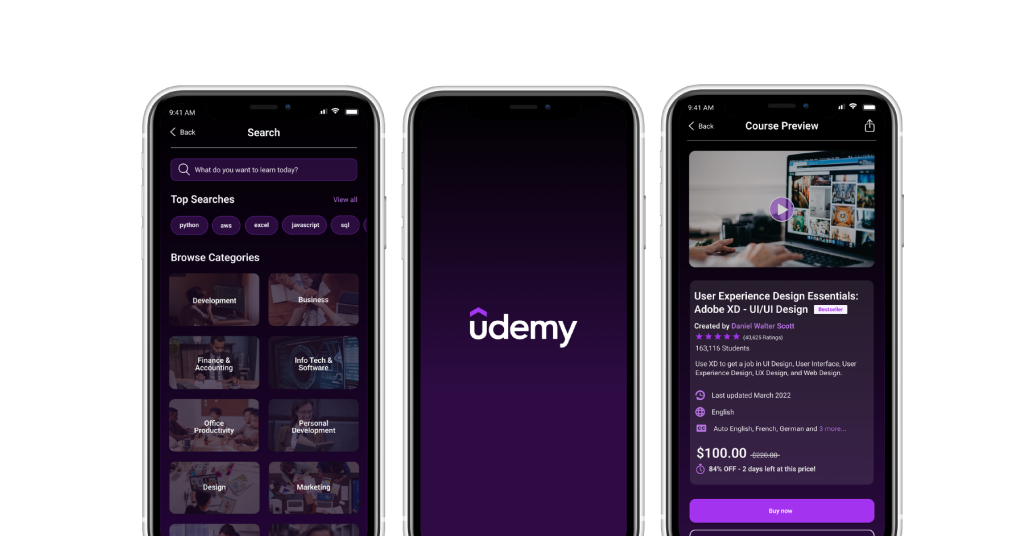
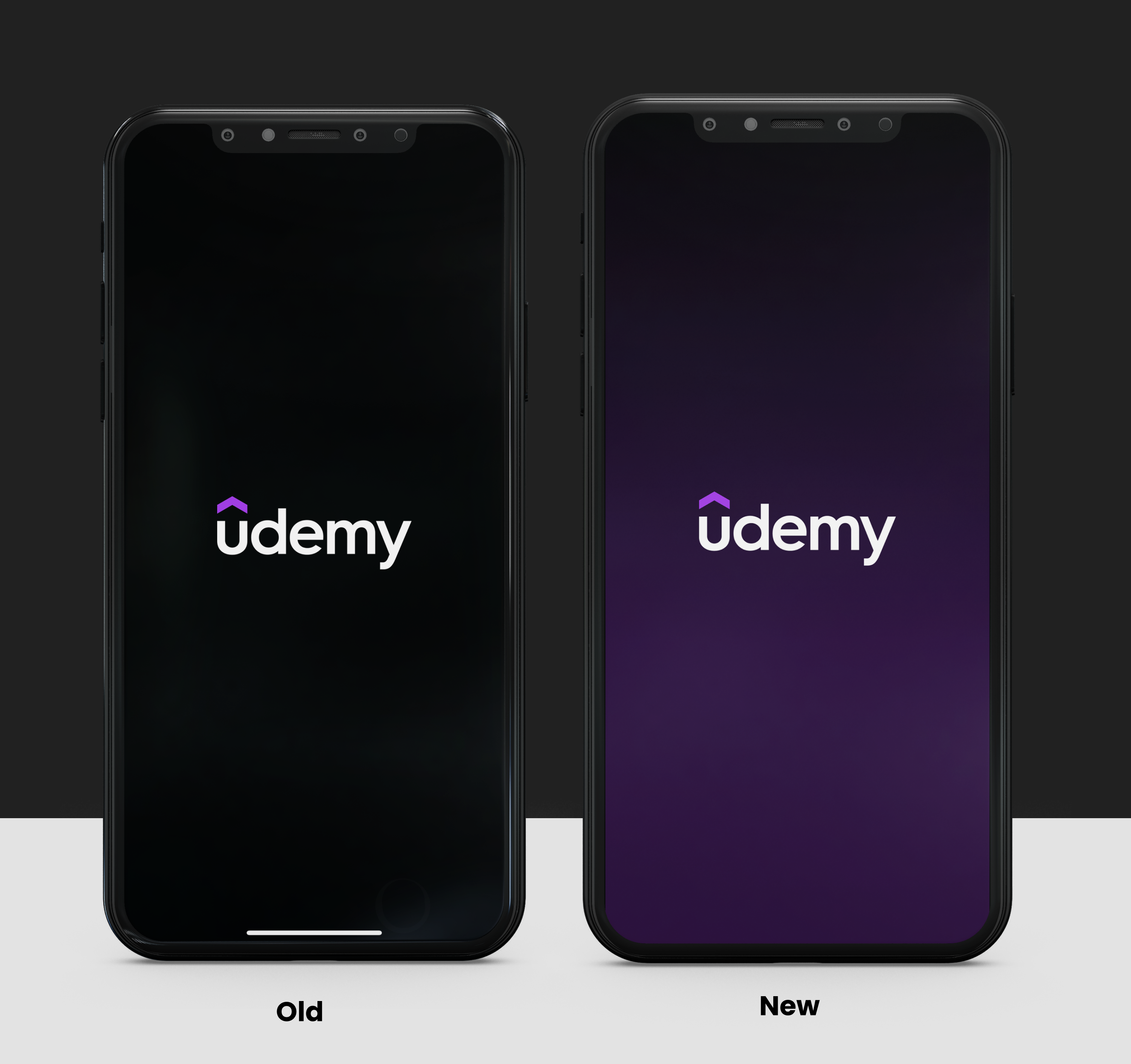
Splash Screen
A combination of the main brand colors (purple & black) were used to make a gradient splash screen to maintain the branding. This is also to give the users the modern feel upon opening the app.
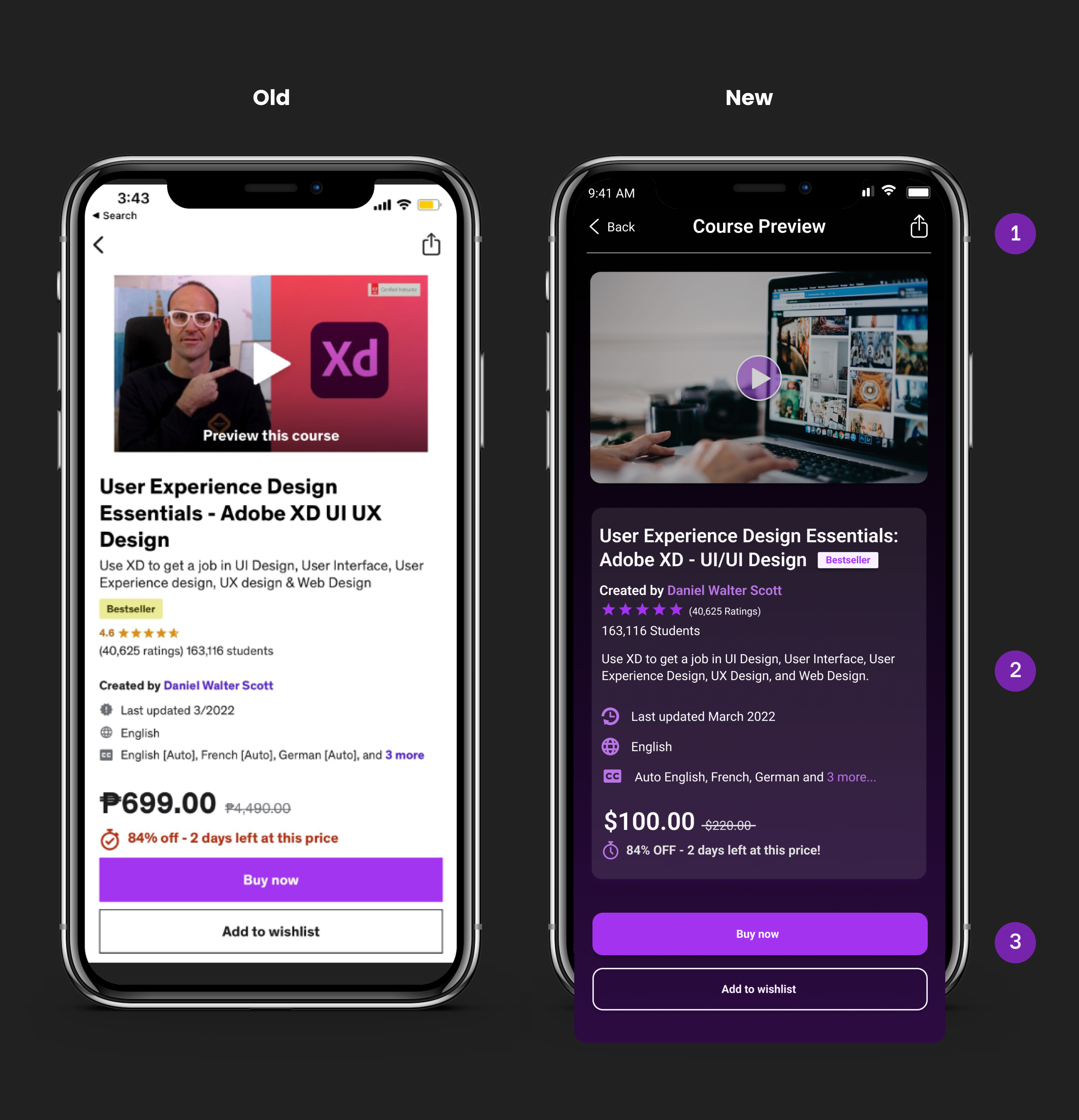
Course Detailed Page
1. I put the current page name at the navigation bar. 2. Rearranged the texts to make it similar with other cards format. 3. Made the primary and secondary buttons rounded similar to other components to maintain the consistency of the design and for easy recognition.
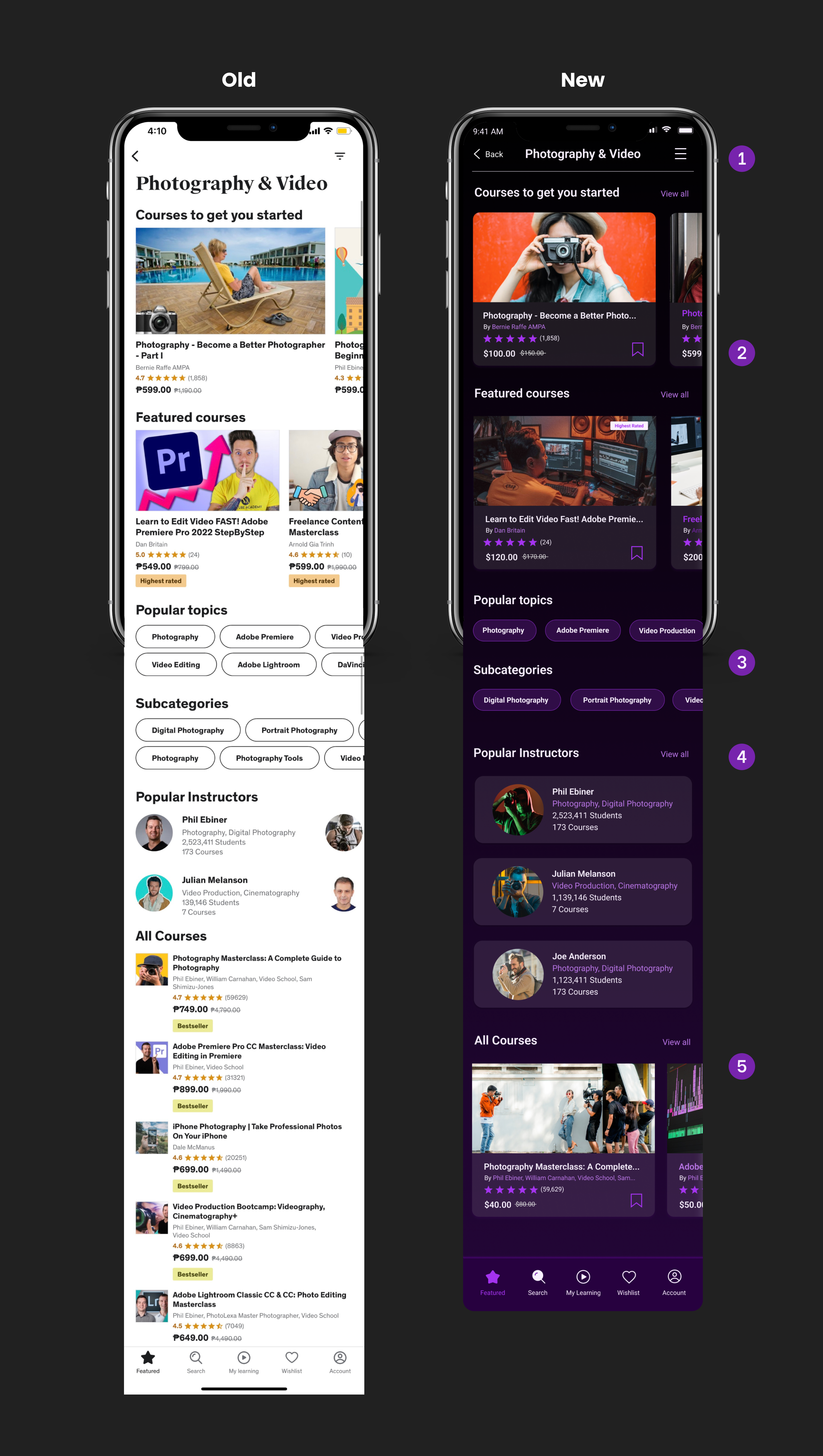
Category Page
1. Redesigned the hamburger button to its standard design to make it more recognizable to the users. Category name was placed to the navigation bar to improve the visual hierarchy of the design.
2. Added a save/add to bookmark icon to give the user the ability to add courses to their bookmarks folder that they can easily access anytime.
3. Removed the extra row for the “popular topics” and “subcategories buttons” to reduce the clutter.
4. Featured only three popular instructors and added a “View all” text link to make it similar to the rest of the sections in the page.
5. Redesigned the cards for this section to align with the rest of app card’s design format.
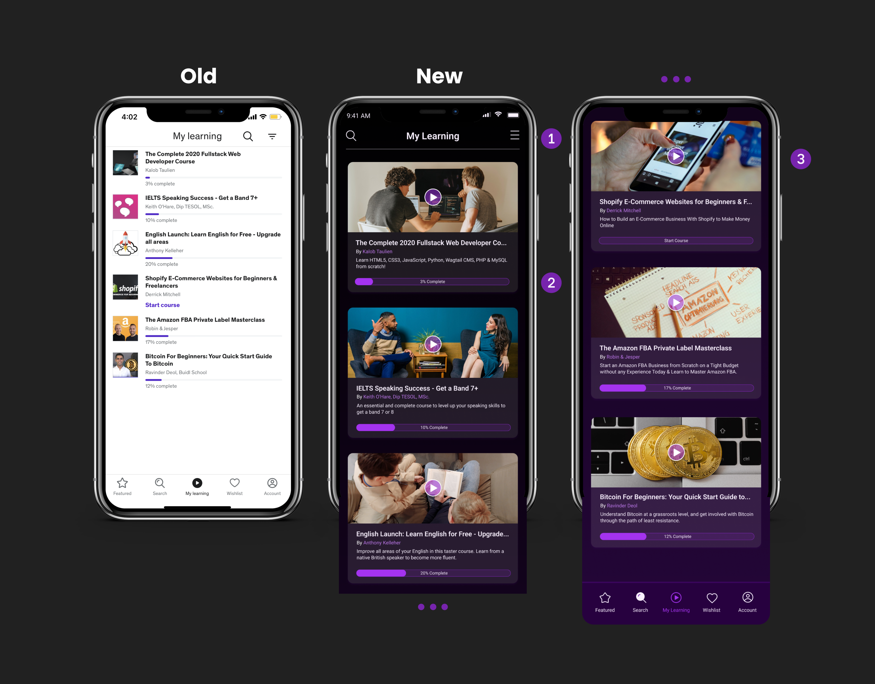
My Learning Page
1. Moved the search icon to the left side to balance the element in the navigation bar. 2. Emphasized the “progress bar” to make the user more excited about finishing the course. 3. A bigger video thumbnail for users’ easy recognition of the course.
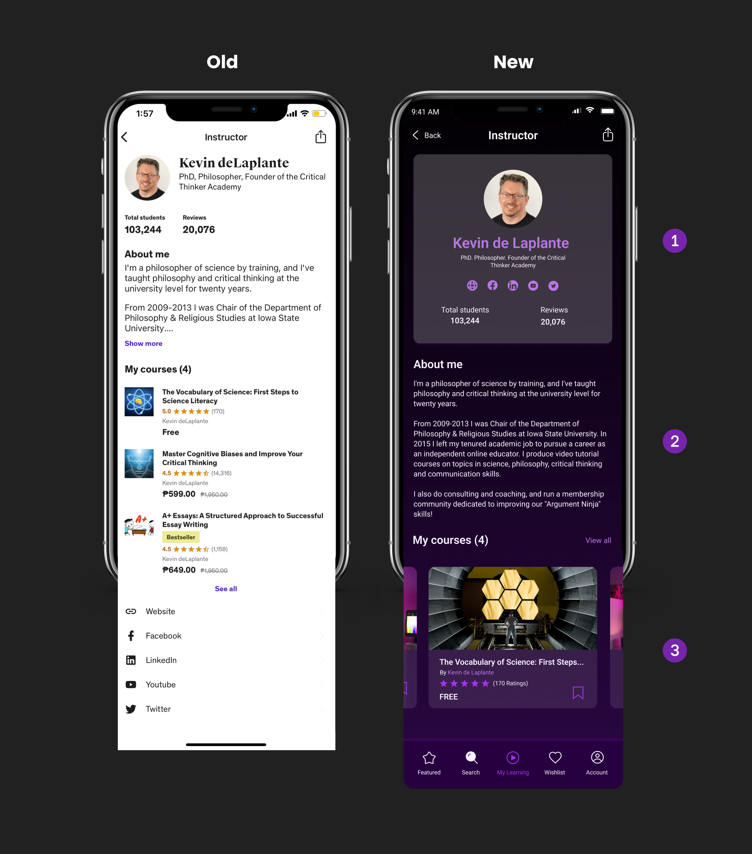
Instructor Page
1. Redesigned the Instructor summary details to highlight the important details about the instructor. This will easily help the users in determining the proficiency of the instructor in the subject matter. 2. Improved the text size and line height for more convenient reading. 3. Swipe the design for the “My Course” section to make it similar to the rest of the sections in the entire app.
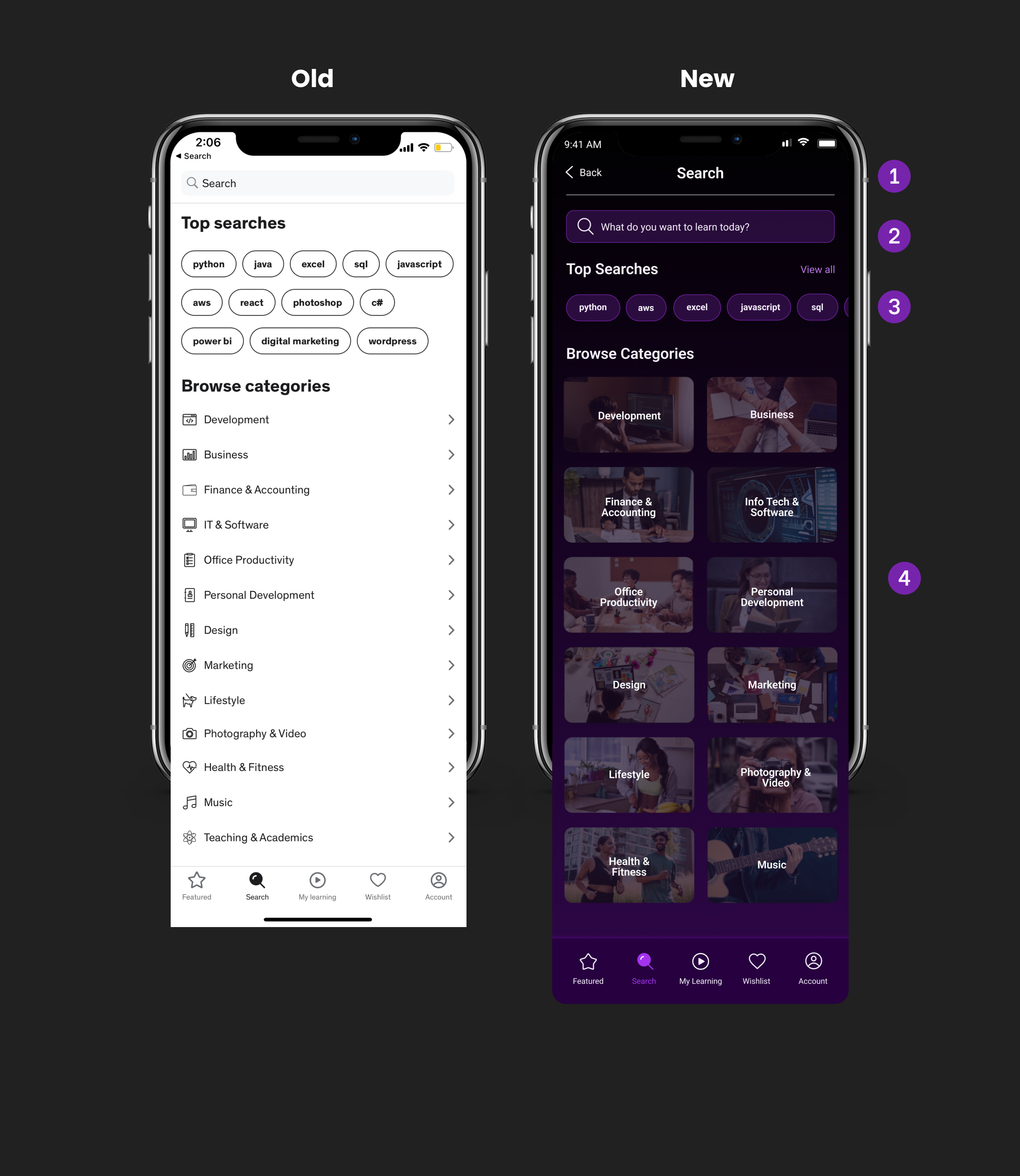
Search Page
1. To keep the consistency of the navigation bar design for the entire app, I placed the search form below the nav bar. 2. Put the sentence “What do your want to learn today?” placeholder text in the search bar form to make it more personal to the users. 3. Reduced the rows for the top search buttons to reduce clutter. 4. Redesigned the categories into cards with real-life photography to make them appealing to the end-users.