Billy | Full Stack Web Application with Data Visualization
Billy is a full-stack web application designed for freelancers, solo entrepreneurs and small business owners who want to make sending invoices fast and easy.
Role and Team Composition
In this project, I worked as a Product Designer (UI/UX) and collaborated with the team to create a user-centred design. Involved in the overall user-experience research and design process (wireframe, mockups, UI prototype), branding, presentation slide deck and photography. I worked with 3 other designers and 4 full-stack developers in 12 weeks to come up with this full-stack web application with data visualization.
Problem
Being a freelancer or a solo entrepreneur poses a lot of time and financial management problems especially if you do everything on your own. This includes the management of the financial flow of your personal and business income and expenses and sending invoices in a timely manner. Currently, there are available financial management tools available in the market but most of them are overwhelming to use and requires a paid premium account to maximize their features.
Solution
A web platform where freelancers and small business owner can generate professional invoices in a fast and intuitive way while having control of the finances related to their business by tracking invoices and payments in a project.
User Flow
Wireframes
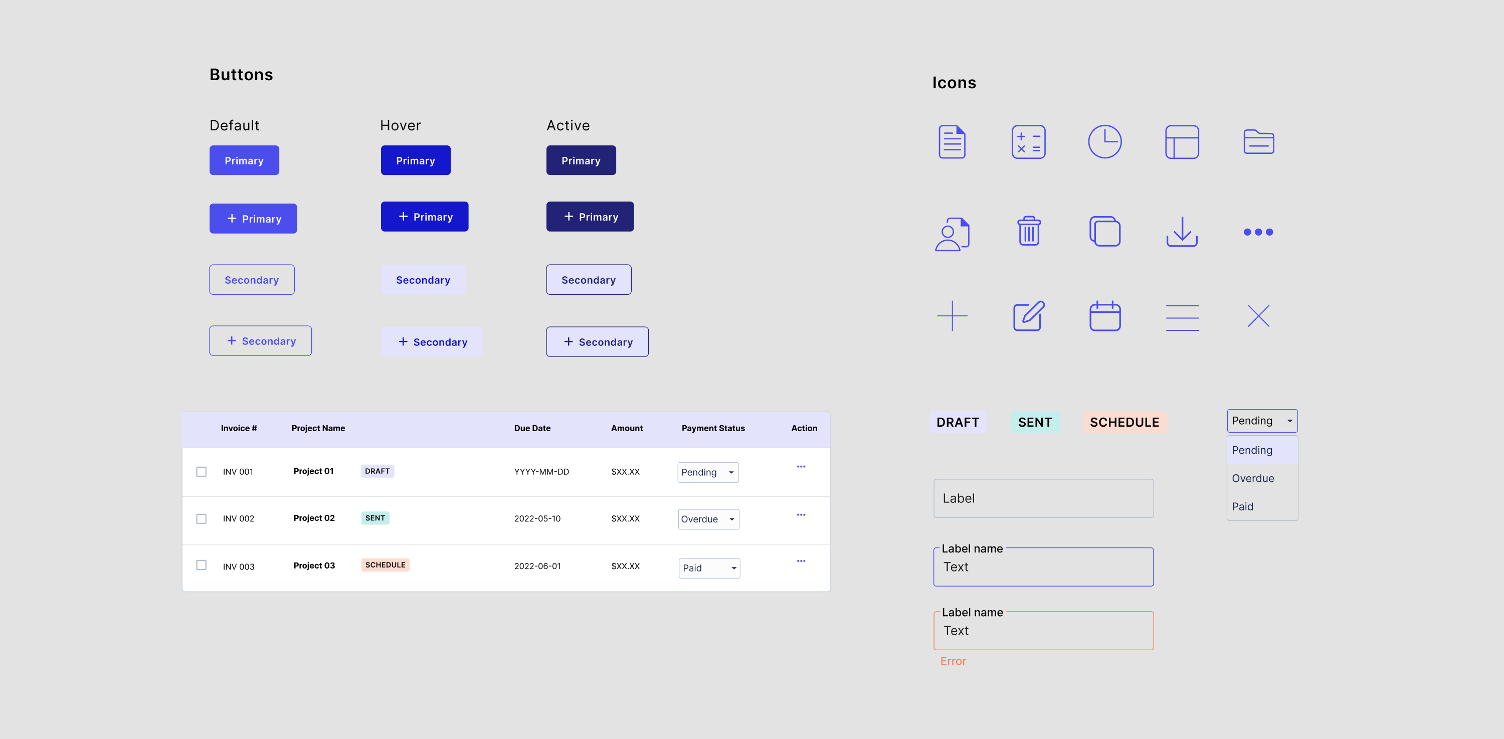
User Interface Design
Brand Logo
Our brand logo consists of the letter ‘b’ and a checked mark. The checked mark symbolizes being done and processed. A sans-serif font; Radjani Bold used to show modernity. The rounded corner on the font and the icon convey that payment and invoice are something that is usually structured but it could be less rigid with Billy’s help.
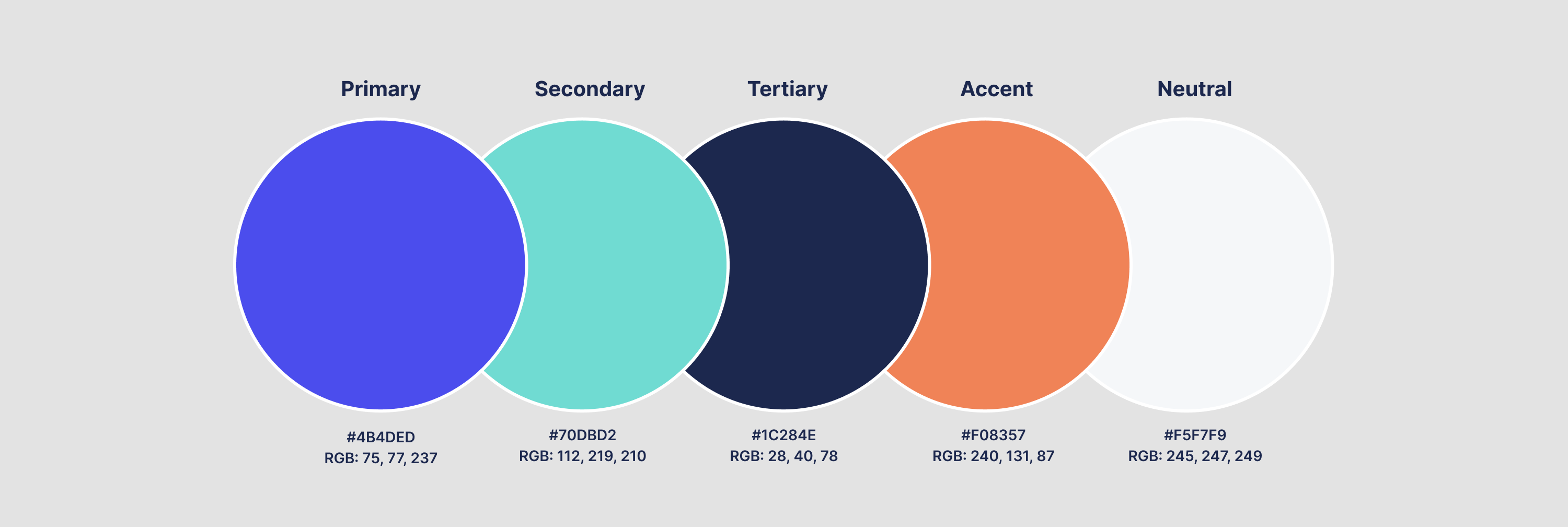
Brand Colours
Combinations of cool analogous colours were used to represent the brand. Iris is the main colour and Turquoise is the secondary colour. Iris is the extension of blue with a hint of purple, to represent reliability, trust, creativity, and wealth. Turquoise is a friendly and cheerful colour. It’s radiating the tranquillity of blue, the growth of green, and the vitality of yellow.
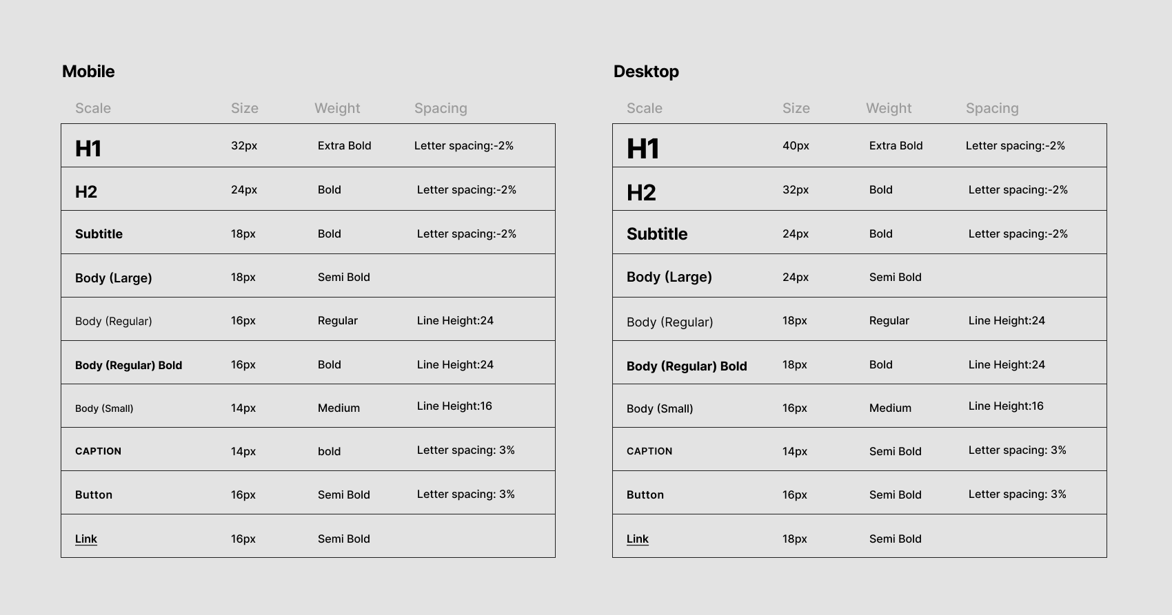
Typography
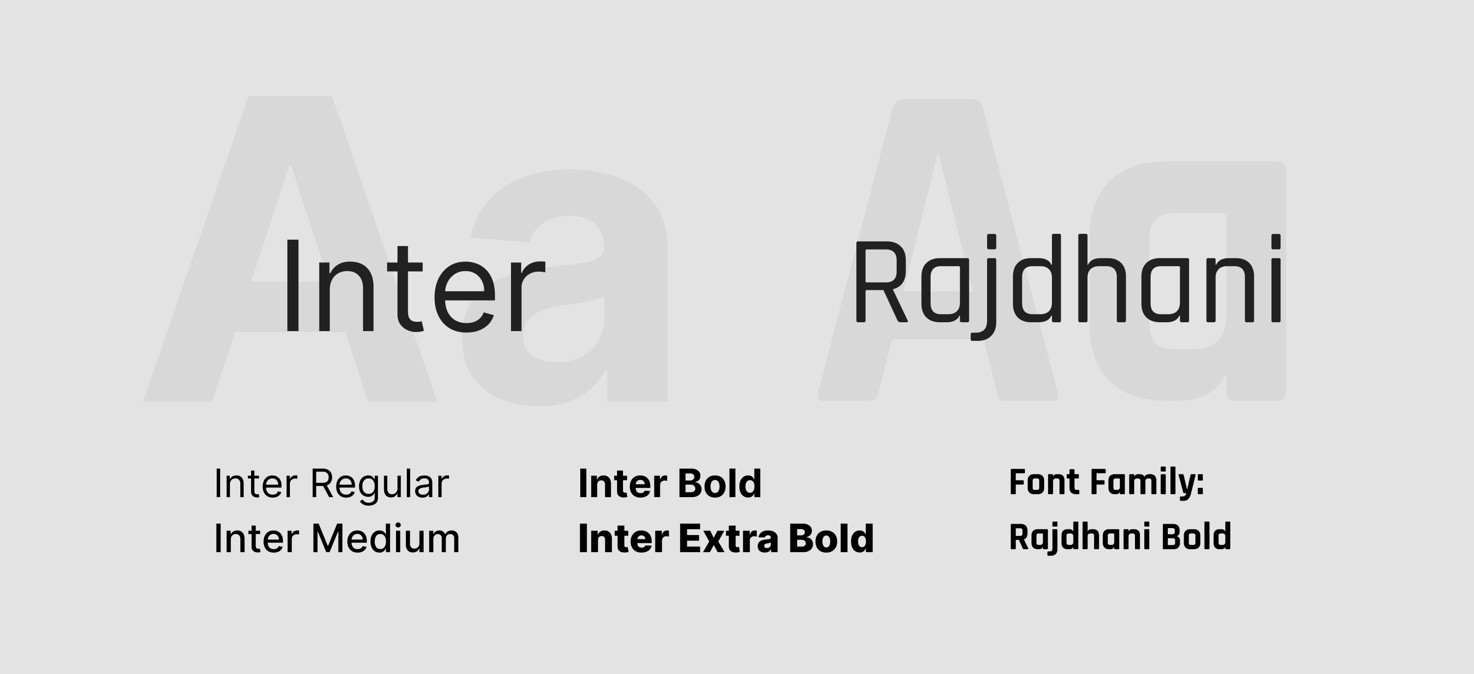
We used two distinct typefaces in our user interface, Inter and Rajdhani. Inter features a tall x-height to aid in readability and is designed for a computer screen. Inter is used as the sole typeface on the website and for the body text of the proposal. Rajdhani has a squared and condensed appearance interpreted as technical or futuristic. The corner is slightly rounded, giving stroke-endings a softer feeling. Rajdhani is used for the logo and headings in the proposal.