
Overview
For this UI design study, I have chosen the responsive website of Meetup. Meetup is an online local community platform that allows individual to meet like-minded people who shared the same passion, goals and drive.
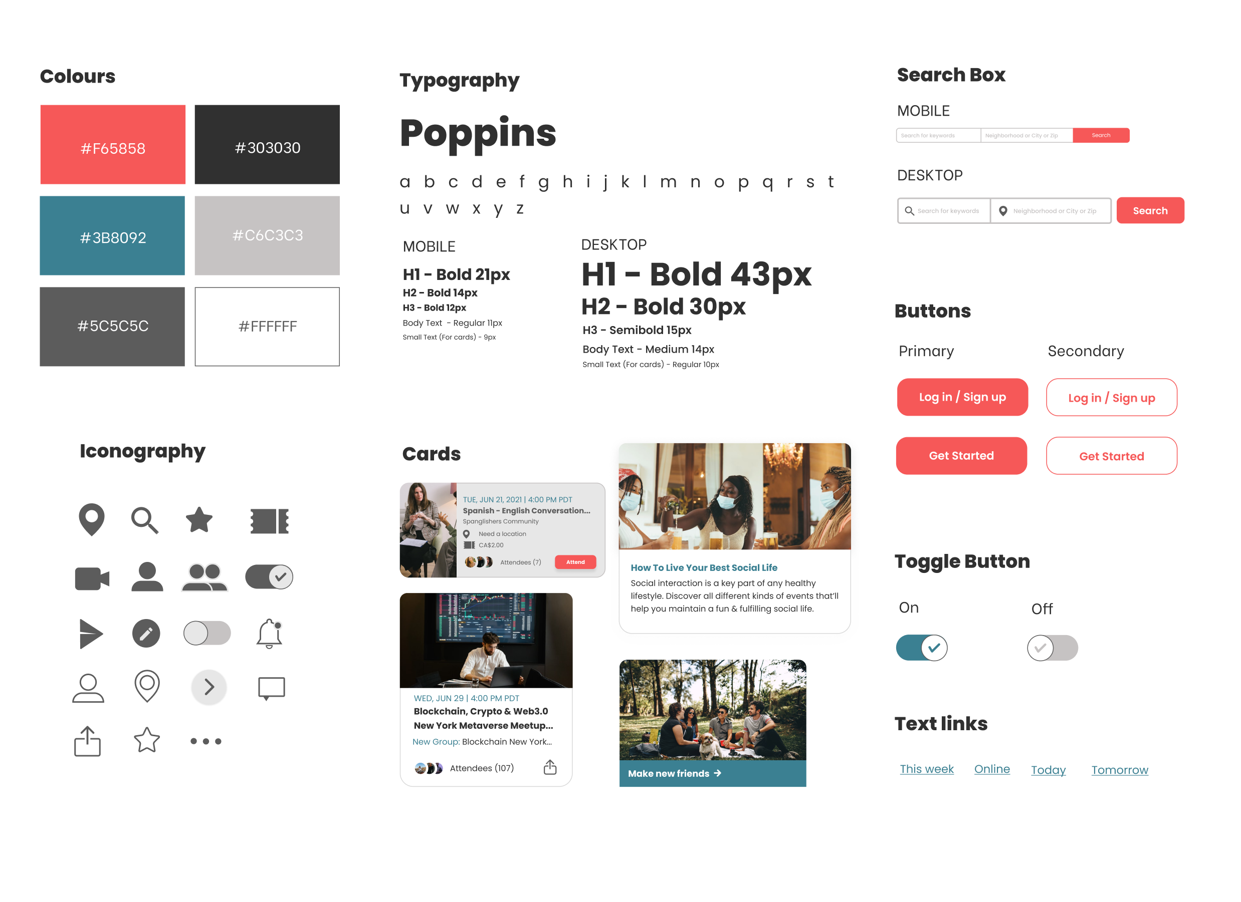
The goal for this redesign is to improve the UI without changing the main branding of the site. I used the same branding colors, but I have to reassign colors into different user-actions. For example, I used the red-pink color for the major action buttons like “search”, “log in/sign up”, and “join meetup”.
I also improved the Icons and typography of the website. A combination of glyph and line icons were used for the redesign. And, as for the typography, I used the typeface “Poppins” for better readability. Poppins is a sans serif typeface and is ideal for modular, clean and minimal website design.
UI Kit
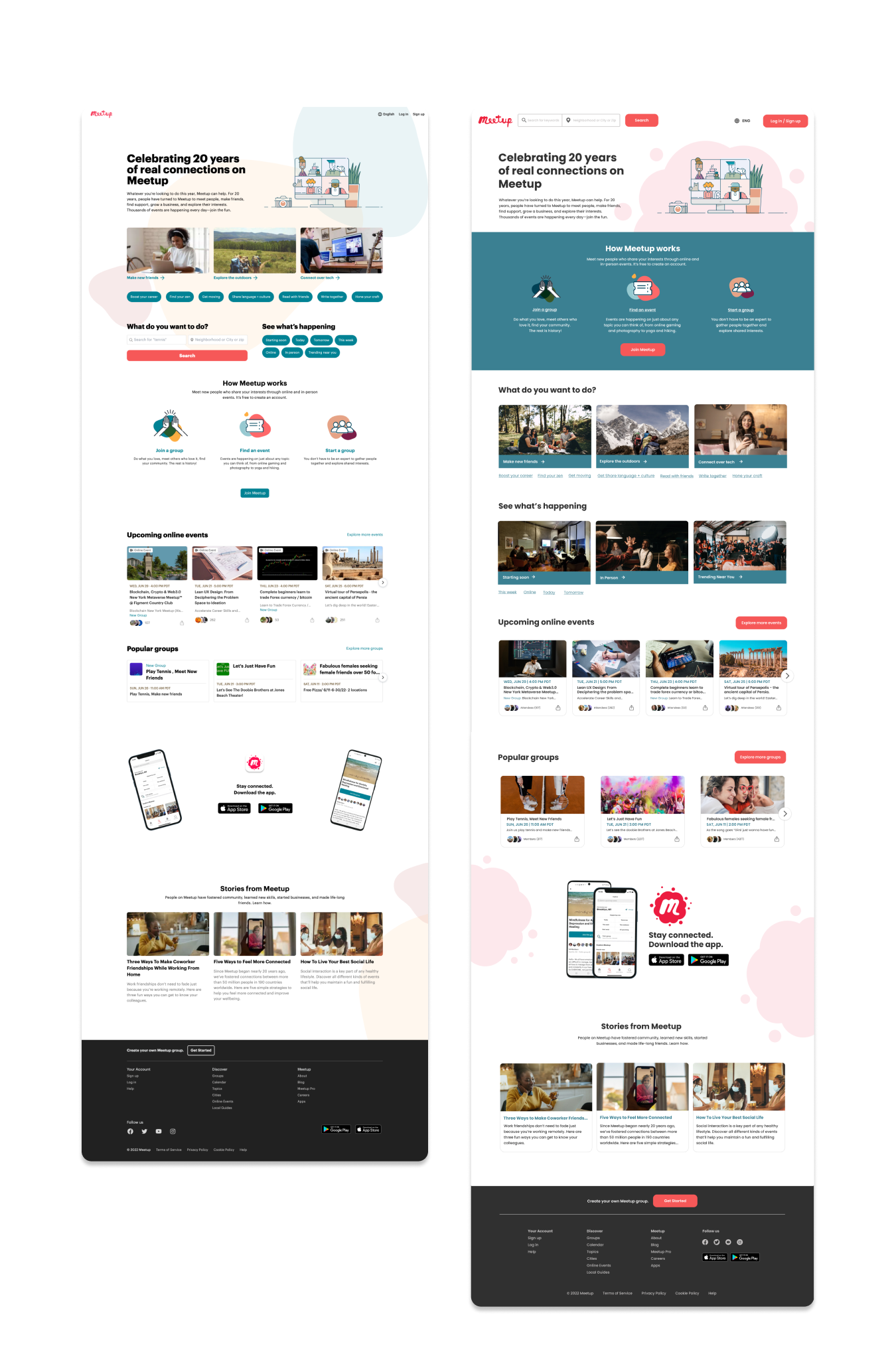
Mobile | Homepage
NOTES FOR THE MOBILE & DESKTOP VERSION
1. Sticky search button. The search for meetup events was placed below the navigation header. This will allow users to easily access the search form as it will be displayed while scrolling down the page.
In the old design, this search functionality was in the middle portion of the page. Meetup is basically for searching for meetup events, so having the search form at the top portion of the page will make it easier for the users to access it.
2. How Meetup works section. This portion is important to highlight on the first screen to educate the user on how Meetup works.
One of the problems from the old design that I want to solve is the lack of division between sections. The teal background is used to create division and indicate the page’s fold.
3. “What do you want to do?” section. Activities were put on a card for a more organized and clean user interface. There are also too many text buttons in the old design so I made them underlined text links to eliminate the clutter on the homepage.
4. Upcoming online events section. I put each event on a card to make it more organized and made sure each text were in-line with the other to keep the consistency of the design in mobile and web version.
I converted the “Explore more events” text link into a button to highlight it.
I also removed the “Online Event” button on each card as everything in this section (as the title suggests) is upcoming online events.
5. Popular groups section. I improved the card’s design and made it slightly uniform in the previous event cards I created. Again, this is to improve the consistency of the design.
6. Download the app section. I redesigned this section as the old desktop and mobile designs were layout badly.
7. Stories from the Meetup section. Each article was put on a card to create division and make it similar to the other components of the site.
8. Footer. There are several different footer designs on each responsive screen, so I created a uniform footer for the mobile and web versions to keep the consistency of the design.
The “Join Meetup” text link was converted into a button for better exposure and increased clicks.
Desktop | Homepage
Desktop | Homepage