Payoneer is an online borderless payment app for digital commerce and independent contractors who sell their services online. Payoneer promises the technology, connections and confidence to involve and flourish in the new global economy.
Overview
For this mobile UX design study, I have chosen an iOS application called “Payoneer”. It is a global payment solution for online businesses, freelancers, and service providers. The goal of this study is to improve the overall user experience by giving them an intuitive way to do the main features which are getting paid and sending payments.
The 5 features/pages that I studied and improved in this design study include the following: Account Info, Transactions, Send a Payment, Home (Landing Page) and Card page.
Original User Flow
Revised User Flow
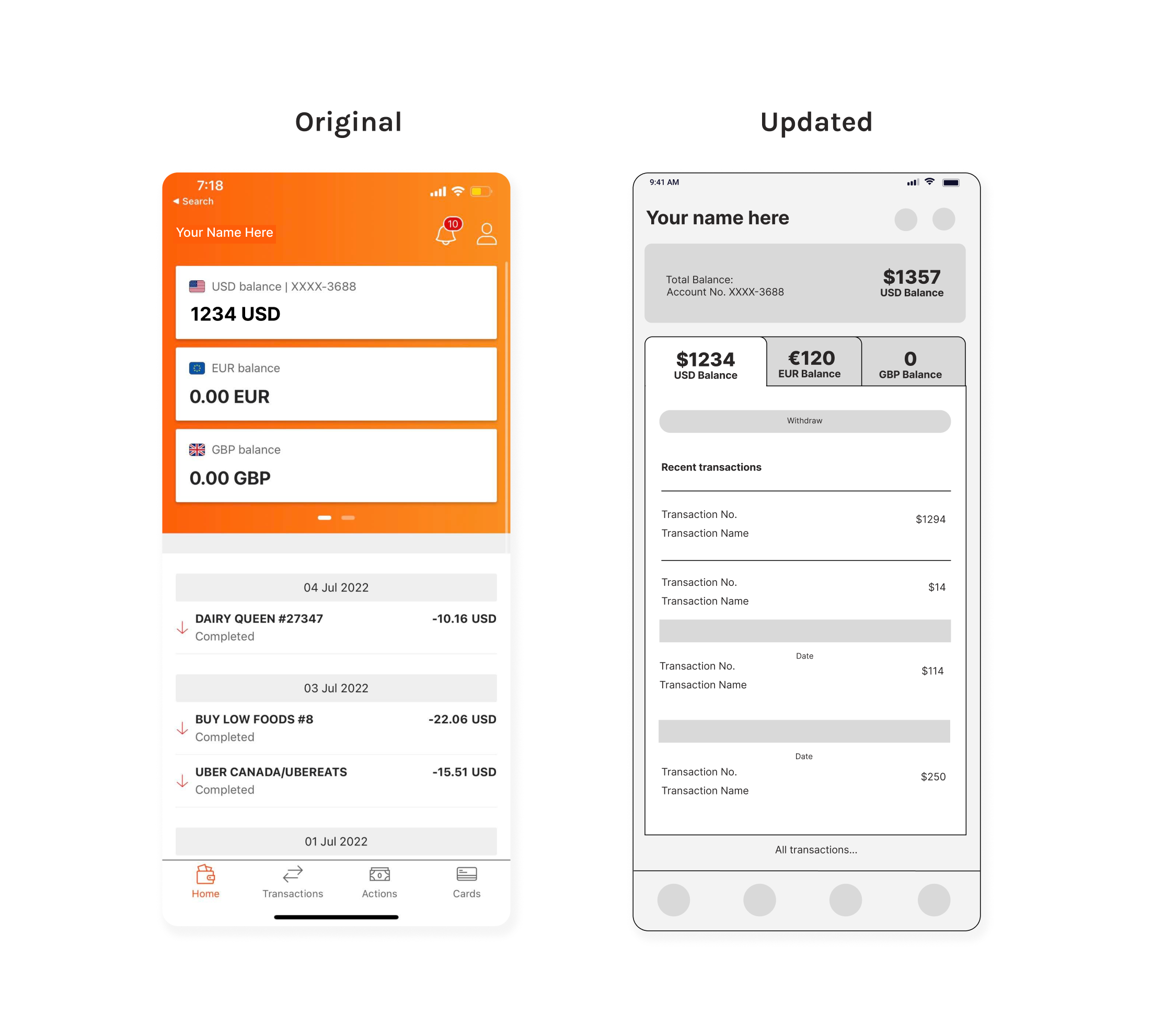
Home Screen
To make the home page (landing page) more intuitive and appealing to the users, I added a “Total Balance” card to sum up all the money that the user has. It will be in USD by default.
Changed the design for easy access to each currency balance with recent transaction history.
Withdraw button can also be accessed easily by tapping the currency balance.
By clicking the text link “All transactions” at the bottom part of the page will lead the user to the “Transaction” section with more detailed filter search functions.
The notifications and account icons will remain at the top-right side of the page.
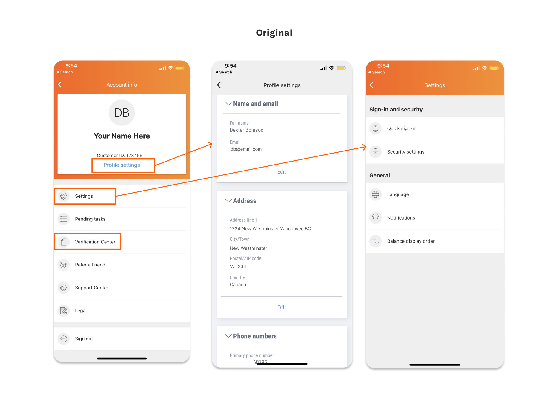
Problem
In the original version, there are two separate settings – the profile/account and general app settings – which can be confusing for users.
There are also too many options on the “Account Info” page that would overwhelm the users
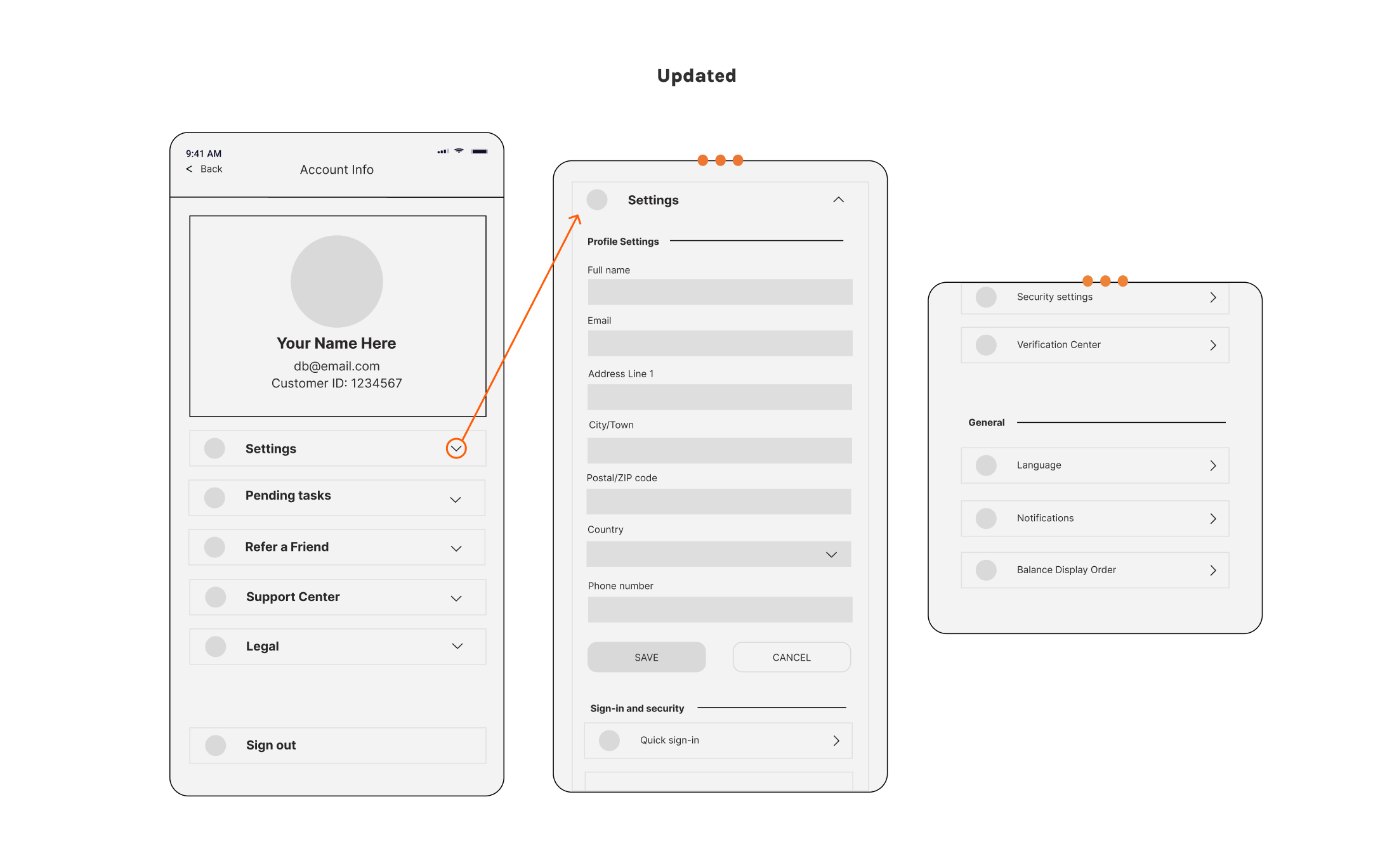
Solution
For the new version of the user flow, I put all the setting options under the umbrella of the “Setting” menu.
Instead of redirecting the users to another page, I made each menu collapsible cards. This will lessen the redirection of the users from one page to another. They can easily close the card by clicking the “up arrowhead” icon.
Save and Cancel buttons will only be activated when there are changes made in the forms. “Verification Center” was moved under the “Sign-in and security” section.
Transactions
Problem
“Upcoming transactions” and “Pending” are exactly the same but there are two separate options.
Unclear presentation/categorization of the transaction history.
Solution
To improve the UX flow of this certain page, I put the filter options at the top part of the page. This will make the search faster for the users to refine the history of their transactions.
Transaction list per “Status” type can be easily accessed by putting the options right in front of the transaction page.
Adding “Apply” and “Cancel” buttons to each filter search items. This will guide the user in refining the search results.
#5 Calendar icon. Users can choose the date range by clicking the icon to launch the calendar control.
Send a Payment
Send a Payment
Problem
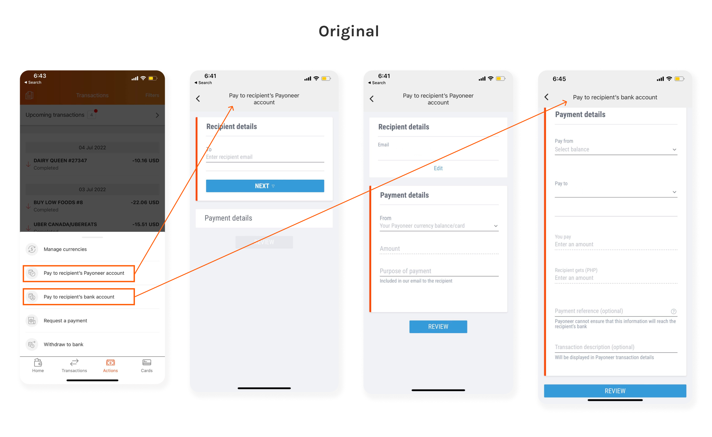
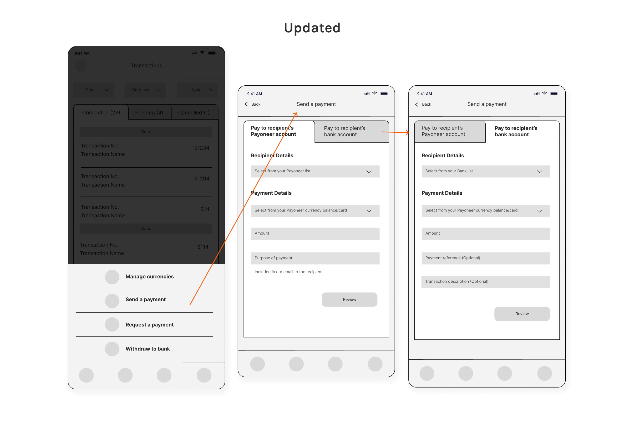
“Pay to recipient’s Payoneer account” and “Pay to recipient’s bank account” can be confusing to the users.
Step by step requirement process to make a payment could be too much for users.
Solution
Instead of having two options for the users in the “Actions” page, I put “Pay to recipient’s Payoneer account” and “Pay to recipient’s bank account” under the “Send a Payment” menu. Users can just click the task they want to perform and the forms can easily access.
Card
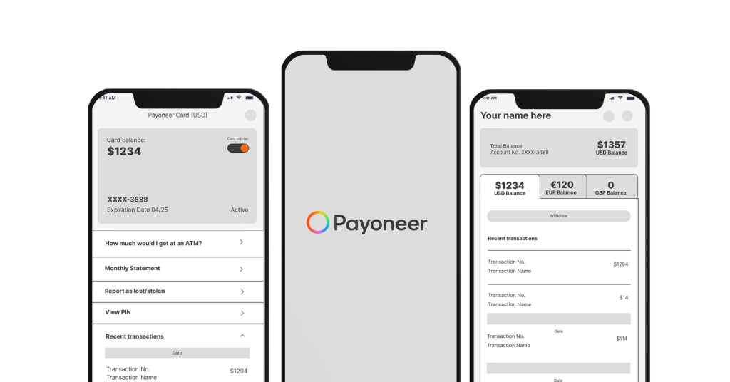
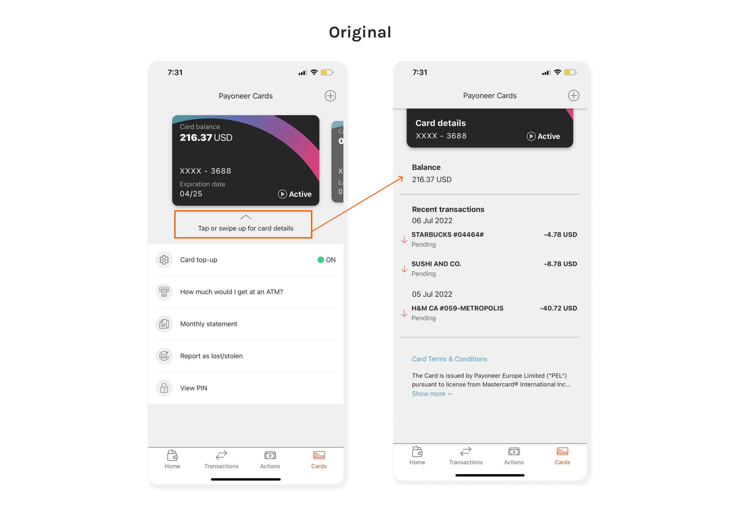
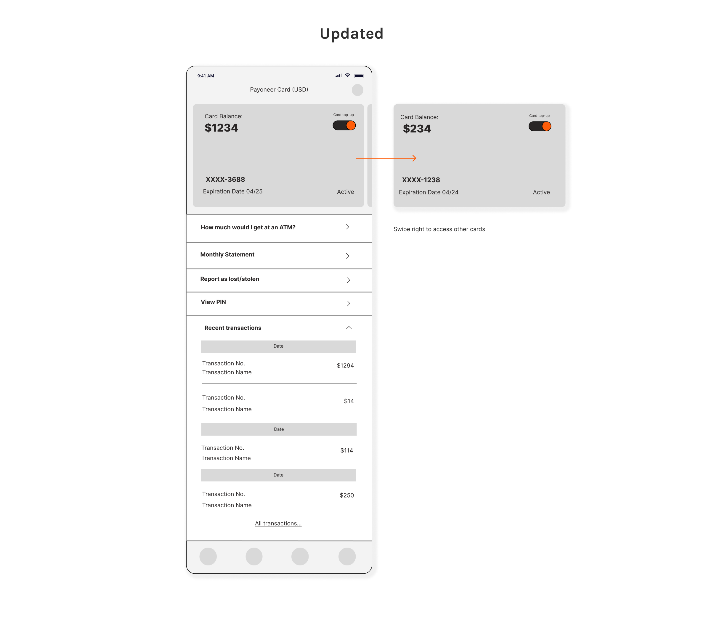
I removed the “tap or swipe up…” and just present the card details right away to the users upon visiting the Card page.
I put the Card top-up on the top right side of the card to make it more visible to the user as this is an important feature of Payoneer.
The addition of arrowheads in each menu option will help the users determine the task/function of that card. All of the menus will lead the user to another page thus the arrowhead is pointing to the right side. While “Recent transactions” has a downward/upward arrowhead to signify that it is collapsible.